JUNE 13, 2024 BY JGPRSTAFF
MANSFIELD –While conducting his extensive research into how to design the new Mansfield Public Schools logo, Jeff Eagles researched every “M” and Hornet that the district has ever used by looking at photos dating all the way back to the early 1900s.
The result, which was unveiled to the school community last week, was a new Hornet logo and letter M that is completely unique to Mansfield and gives the district its own identity while staying true to the history of the Hornets.
“Your identity should embrace your past, but also highlight what you want to celebrate going forward,” said Eagles, owner of Canton-based design company Jeff Eagles Creative.
Eagles has worked on several logo rebranding initiatives for local school districts and professional sports teams including Canton Public Schools, Attleboro Public Schools, the Hockomock League, the Las Vegas Golden Knights, the Toronto Maple Leafs, the Florida Panthers and more.
To authentically capture and create the district’s vision for a new logo, Mansfield Public Schools administrators partnered with Eagles in February 2024. Over the next four months, Eagles worked with a variety of Mansfield stakeholders and multiple working groups to complete the project.
To kick off the process, an initial working group comprised of Superintendent Murphy, Assistant Superintendent Michael Connolly, Mansfield High School Principal Russ Booth, Athletic Director Tim Selmon and Assistant Athletic Director Michael Redding was tasked with working alongside Eagles to form a briefing, detailing their expectations and vision for the new logo. Eagles spoke about the importance of this initial meeting, “The briefing is a key meeting with stakeholders that prompts soul-searching questions about the client’s brand and is used to guide the entire process.”
As a result of that meeting, district officials told Eagles they were looking to continue the use of their historic Hornet mascot, they wanted a fresh, but similar shade of green to compliment their primary mascot colors of green and white and sought a unique font for letters and numbers for all official uniforms and signage. It was very important for them to keep the letter M and Hornet identity. But district leaders wanted a more Mansfield-ownable version as the previous logos were borrowed from college teams and other sources and multiple versions were being used in a variety of ways throughout the district. This process ensured that the new design would be unique to Mansfield Public Schools and give the district its own branding and identity.
Throughout the following months, feedback was solicited from a second, larger working group made up of stakeholders including, students, alumni, school committee members, parents/guardians and community members. These meetings gave Eagles the opportunity to receive feedback on initial drafts of the logo and make revisions as needed. “In order to get broader input from the community that this rebranding would impact the most, it was important to get feedback and input from present and past students and members of the community,” Eagles said. “People who understand the community and can bring different points of view to the group and hopefully broadcast some of the positive aspects to the community.”
Behind the scenes, Eagles completed a competitive analysis, which included researching the history of the Mansfield “M”, the Hornet mascot, and the color green. The district has photographs of the “M” on uniforms dating back 100 years. Green, a primary color for the school, was selected by the 1909 baseball team for their uniforms and became widespread throughout the high school. The Hornet was selected as the mascot in October 1945 by a student vote. In the 1940’s, “The Green Hornet” was a popular serial on radio. Finally, Eagles noted that the team uniforms have, for decades, written the name Mansfield in a radial arch on the front of the uniforms. It is reminiscent of the train tracks that run through town and had such an important economic impact on the community. It was important to the group to honor the history and tradition of the community as they sought to update and unify their visual identity.
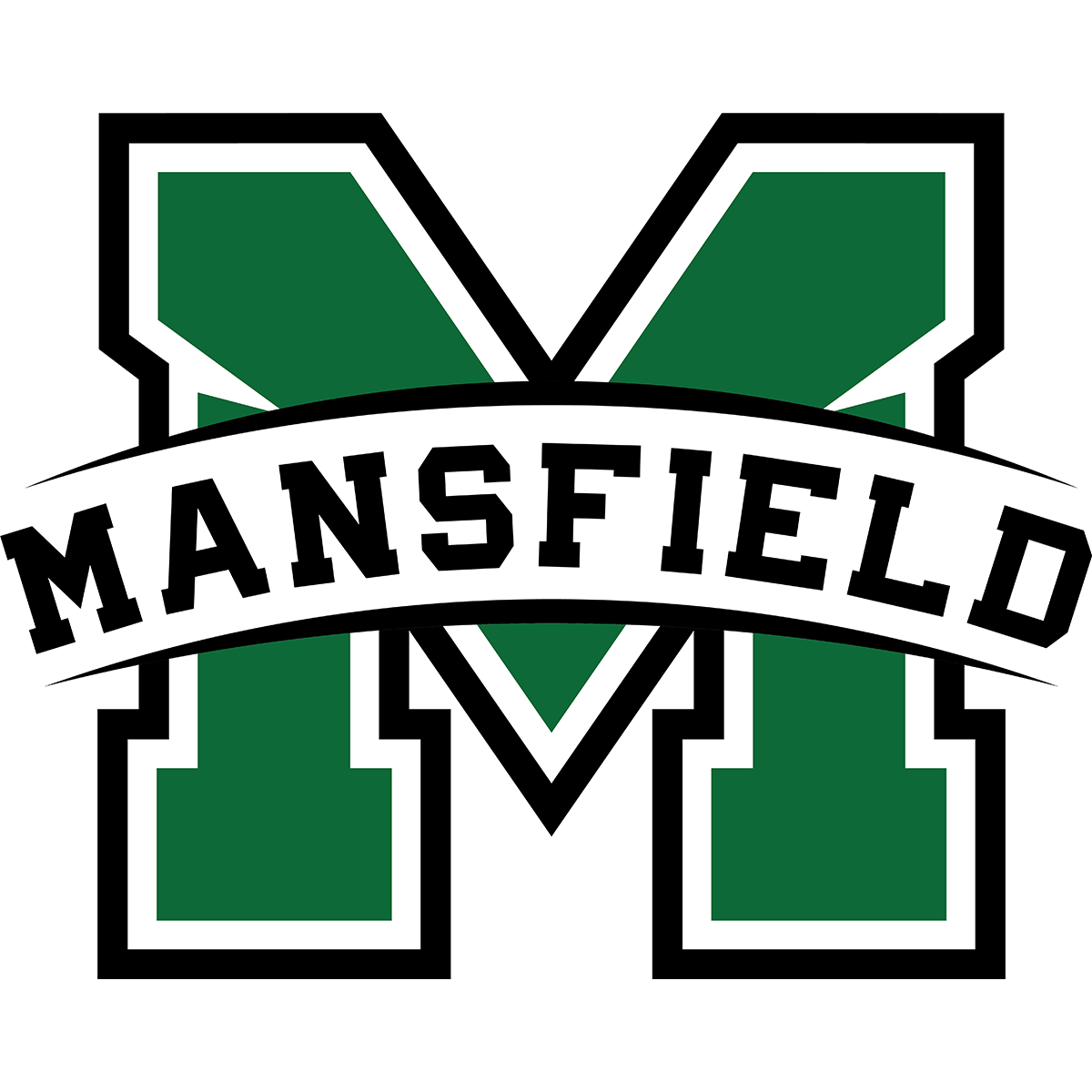
The end result was a Hornet and letter M which are completely exclusive to Mansfield Public Schools. The hornet appears in a prepared stance with a toned physique and its stinger pointing forward. The look on its face is determined, while its two wings are pointing upward. Wearing a white t-shirt with the new “M” logo ties it directly to Mansfield. The top corners of the letter “M” were designed uniquely to match the shape of the wings of the Hornet logo. Wordmarks incorporate the radial arch that is evocative of the town’s train tracks. Eagles made sure that the color green used was unique when compared to the other teams in the Hockomock League schools.
“On behalf of the entire district, I would like to thank Jeff Eagles for capturing the essence of our district within these designs,” said Superintendent Murphy.
“Throughout this process, we aimed to be inclusive of students, faculty, parents and community members and are thankful for all of the input we received. We are proud of the success of this project and thankful to the entire school community who made this possible. We now have a logo and mascot we can call our own and will clearly identify that we are the Mansfield Public Schools.”
Use of the updated logo in signage and uniforms will be rolled out gradually. The graphics are available to the schools as well as to outside groups.
To view the new logo style guide, click here.
“This was a great experience working in Mansfield and usually a project like this takes up to a year and we were able to get it done in four months,” Eagles said. “I am very happy with the finished product and am excited that they will be able to immediately begin using it and that it will be on their new turf athletic field. This was overall a great experience.”

